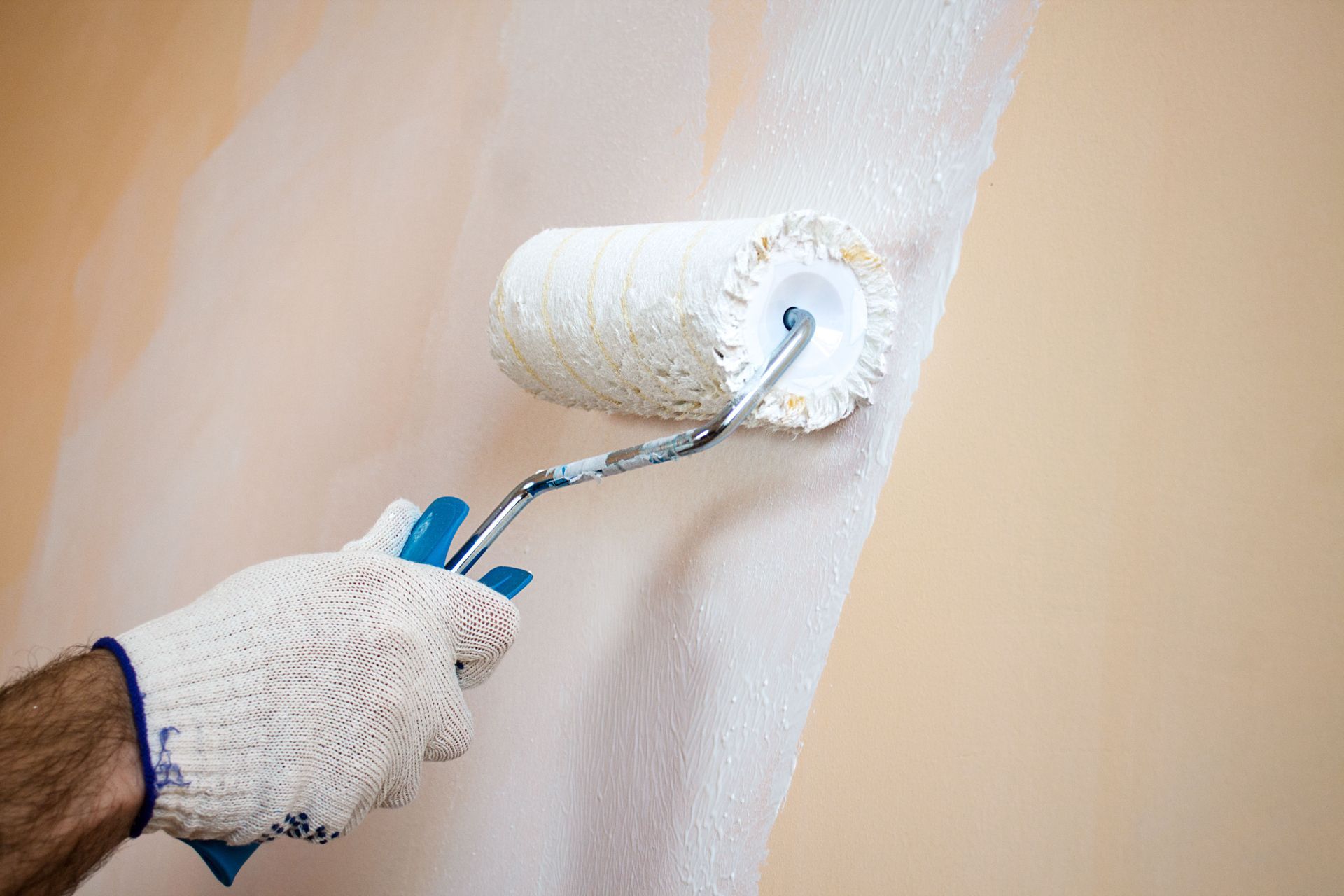
Color is a fundamental component in home design, as it has the power to transform spaces, influence mood, and even affect our perceptions. Understanding how each color works within different settings can improve your home environment, making it more comfortable, inviting, and reflective of your personal style. By comprehensively exploring the effects of color, you can optimize your residential painting and make informed choices to uplift your habitat overall.
The Psychology of Color
Warm vs. Cool Colors
The first step to residential painting is understanding how colors affect us. Warm and cool colors play a significant role in determining the atmosphere of a room. Warm colors, such as reds, oranges, and yellows, possess an energizing quality that can stimulate and open up spaces. On the other hand, cool colors like blues, greens, and purples have a relaxing effect that can make spaces feel calm and serene. These temperature-linked colors can also influence our perception of space; warm colors often make spaces feel more intimate, while cool colors can create a sense of withdrawal or expanse. Deciding on which palette to use depends on the function you desire for a particular room.
Neutral Colors and Their Impact
Neutral colors are essential elements in home design because of their versatility and understated impact on a room's atmosphere. Shades like whites, beiges, greys, and taupes act as backdrops that allow other colors and decorative elements to shine. Neutrals often provide a sense of calmness and cleanliness, making them ideal for creating a timeless and classic aesthetic. They can also be practical choices for highlighting architecture and enabling light to flow unobstructed. Using neutral tones skillfully ensures a balanced environment that works harmoniously within various design settings.
The Power of Bright and Bold Colors
Bright and bold colors are dynamic tools that can add life and energy to a room. They demand attention and work wonders in establishing focal points within a space. For example, a vivid red feature wall can create a strong impression and stimulate conversation in a living room. However, the use of bold colors requires careful consideration, as overuse can easily overwhelm. Integrating these colors lightly into residential painting, or in the form of accents and accessories, can achieve a striking balance of vibrancy and sophistication.
Color and Room Functionality
Designing a Relaxing Bedroom
For a bedroom that promotes rest, softer and cooler color palettes are preferable. Gentle blues, soft greens, and muted lavenders create a peaceful ambiance that facilitates restful sleep. These colors have been shown to lower blood pressure and heart rate, aiding in physical relaxation at the end of a long day. Earthy tones such as warm beige and taupe can also be comforting, providing a nurturing and soothing touch. Combining these palettes helps establish a calming retreat within your living space.
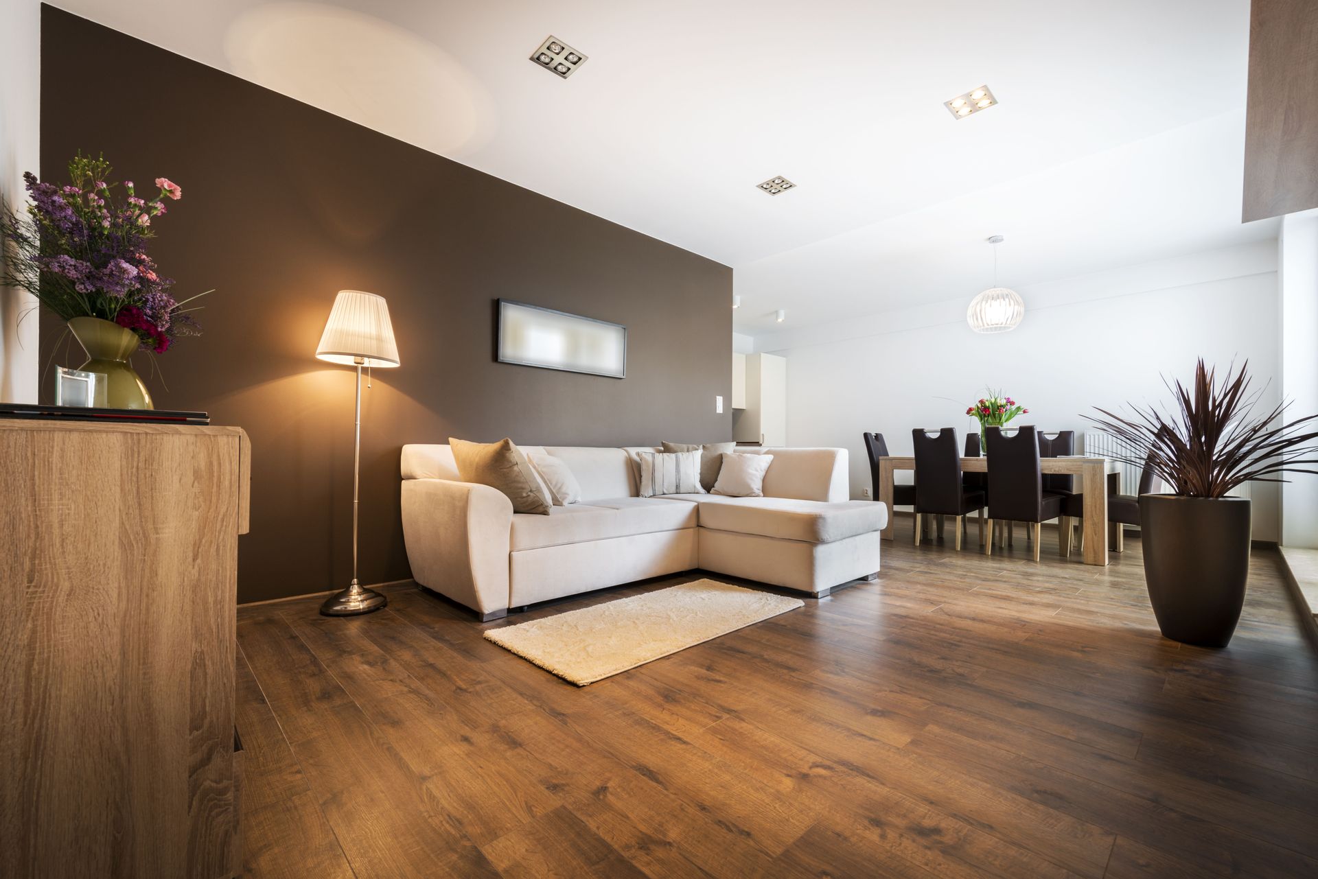
Energizing a Living Room
Living rooms thrive on colors that energize and encourage social interaction. Warm tones like burnt orange, deep red, or golden yellow are often favored for these spaces because of their ability to foster warmth and hospitality. Such colors can make guests feel welcome and at ease, stimulating conversation and connection. Adding contrast, like touches of green or blue, can inject an element of freshness or calm to mitigate any overly intense energy. These complementary choices ensure that the living room is both stimulating and comfortable for gatherings.
Creating Inviting Dining Areas
Colors play a pivotal role in the dining room, enhancing the overall dining experience. According to Revive Real Estate, well-selected exterior colors can increase a property's value by 2-5%, a consideration that extends to indoor color choices as well. Warm colors, such as rich reds, oranges, and golden hues, are known to stimulate appetite and conversation. Meanwhile, using elegant shades like wine or olive creates a sophisticated ambiance that unifies the dining experience. These residential painting choices can make dining areas inviting, memorable, and attractive to guests and households alike.
Color Combinations and Styles
Monochromatic Schemes
Monochromatic color schemes involve variations within a single color for a subtle and sophisticated style. By varying the tint, tone, and shade, you create depth and interest while maintaining visual cohesion. This approach builds a serene and sophisticated atmosphere, making it ideal for spaces where tranquility is desired, such as bedrooms and bathrooms. Soft pastels or deep jewel tones can provide quiet elegance, while brighter hues serve a more cheerful, modern look. A well-executed monochrome palette is versatile and timelessly chic, and stands out as the residential painting go-to.
Complementary Colors
Complementary colors are pairs of colors found on opposite sides of the color wheel, such as blue and orange or red and green. These colors naturally enhance each other, providing brilliance and vibrancy to a room. Because they stand out, they add a dynamic contrast and depth, making spaces feel lively and energized. This combination is often used in spaces where activity and interaction take place, like kitchens and living rooms. Effectively balancing intensity and complementarity, these schemes achieve appealing visual harmony without being overly stimulating.
Eclectic and Bold Mixes
The eclectic mix of unexpected colors offers boldness and the opportunity for personal creativity in home design. These choices break the rules on one level, resulting in unique environments teeming with character and charm. By carefully balancing patterns and textures, eclectic blends can remain balanced despite their bold nature. These vibrant mixes are perfect for those who want residential painting that's tailored, expressive, and often playful. Eclectic styles encourage experimentation, inviting homeowners to inject individual identity and innovation into their living spaces.
The Influence of Lighting on Color
Natural Light’s Effect on Room Color
Natural light has a significant impact on how we perceive color within our homes. Spaces with southern exposure tend to be warmer and cast grayer or yellowish hues on walls, while northern natural light creates cooler tones. The orientation of windows and the time of year can dramatically alter these perceptions, leading to color choices looking different from what was intended. It's crucial to test color swatches at different times of day before making final choices. Natural light acts as a living component of interior design, continuously shifting a room's ambiance.
Artificial Lighting Types
Artificial lighting also alters the appearance of colors, affecting how environments feel during different times of the day. Incandescent bulbs emit warmer, yellowish tones, complementing warm colors and creating a cozy space. Fluorescent lighting can seem cooler, which interacts differently with blue and green palettes, often leading them to appear more sterile. LED lights provide versatility, coming in various temperatures and offering an energy-efficient way to tailor color perceptions to your advantage. Understanding these interactions ensures the desired ambiance aligns regardless of natural lighting limitations.
Dimming and Color Mood
Dimming capabilities offer control over the intensity of light, which can significantly affect color mood and perception. Rooms with dimmable lights can seamlessly transition from bright and energetic in the day to soft and intimate as evening sets in. This transition enables spaces to become multifunctional, adapting light and color to suit different activities and times. Coupled with smart lighting technology, dimming systems provide added flexibility and ambiance control, supporting an expansive variety of color interactions. These abilities enhance not only the functionality but the emotional resonance of interiors.
Color is one of the most powerful tools in home design, capable of shaping mood, enhancing functionality, and expressing personal style. From the calming influence of cool tones in bedrooms to the energetic warmth of vibrant living spaces, thoughtful color choices can dramatically transform the way a home looks and feels. Ultimately, successful home design is about achieving balance, comfort, and harmony—and color remains at the heart of that transformation. With careful planning and creativity, residential painting can turn any house into a welcoming and inspiring home. To get a professional opinion on your home's palette or initiate home painting, reach out to Ryan's Painting today.